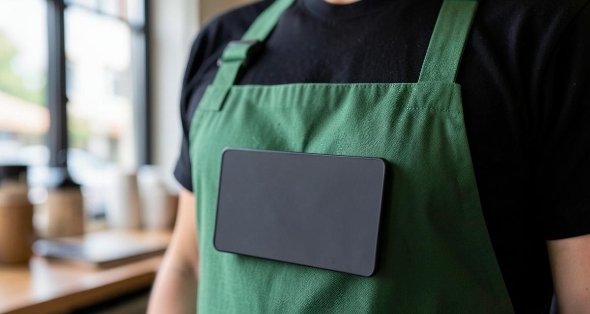
First name only, high contrast, and a backing that survives a wash cycle. The cafe badge formula, and where independents usually slip.
Walk into any large coffee chain and the badges look almost boring. That is the point. A cafe badge has one job, which is letting a customer use a first name in a four second exchange across a counter with a grinder running. Everything the big operators do to their badges serves that, and most of it costs nothing to copy.
First name, big, and nothing else competing with it
Chains put the first name at the largest type size the badge allows and give the logo the smaller share of the space. On a 1 x 3 inch badge you get roughly 13 characters at 26 pt before the name has to shrink, which covers almost every first name. The moment you add a title line, move up to 1.5 x 3 so the name keeps its size instead of dropping to fit.
Last names are the usual mistake in food service. They double the text on the badge, and a customer at a register has no use for them. Keep last names for offices and clinics where staff need to be identified formally.
Contrast beats brand color
Dark badge with white text, or white badge with dark text. Cafes are lit unevenly, steam fogs everything, and a mid tone green name on a mid tone green badge is unreadable at three feet no matter how well it matches the brand guide. Put the brand color in the logo or a border and leave the name in maximum contrast.
The backing decides whether it survives the job
| Backing | Works on | Failure mode |
|---|---|---|
| Two bar magnet | Aprons, tees, knit polos | Slides on heavy canvas if the badge is large |
| Swivel clip | Apron bibs, shirt pockets, thin fabric | Comes off with the apron and gets laundered |
| Clutch pin | Uniform shirts | Leaves visible holes over months |
Magnets are not suitable for anyone with a pacemaker or implanted defibrillator, so keep a pin or clip option on hand.
The laundry problem is real and worth planning for. If badges live on aprons, count on losing some to the wash, and order spares with the first run rather than one at a time later.
Printed or engraved for a cafe?
Printed plastic is the sensible default: full color logo, cheap to replace, fine for indoor wear. Engraved two ply is the upgrade if badges get grease, steam and sanitizer daily, because the name is cut into the material instead of sitting on top of it as ink. Engraving is a two color process though, so a multicolor or gradient logo has to be printed.
Reusable badges for a shift schedule
High turnover and part time rosters are the case for a reusable frame with a printed insert. The frame stays with the store, the insert changes with the person, and a new hire is badged the same day instead of waiting on production.
Set the badge like a sign, not a business card. Name first, logo second, everything else off the badge.
A layout that just works
- Logo left, first name to the right at the largest size that fits.
- 1 x 3 inch for first name only, 1.5 x 3 inch once a title or store name is added.
- Dark background, white text, or the exact reverse.
- Magnet as standard, clips for apron staff, pins available on request.
- Two or three spares per ten badges ordered up front.